Acurate colour rendition verse a beautiful look.
I recently worked on a programme filming famous paintings. Colour reproduction in these works of art was obviously very important. With a normal scene an editor or colourist can change the picture and grade the scene how he or she likes, with a work of art there is a very clear right way and a wrong way, and what is more, the editor might not have a reference image of how the picture should look. You might think this would be easy, surely a camera will acurately reproduce colours, but this simply isn't true. Cameras have a certain "look" or feel to them, this is done by the way in which they interpret colour. This is true of all colours but it is particularly noticable with green. If you point your camera at a colour chart like a colour du monde and turn on your vector scope, you will notice some colours are more acurately reproduced than others.
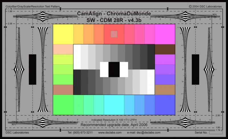
If you point your camera at various sections of the chart it will quickly become obvious which sections of the chart refer to which sections on the vector scope. Regardless of which CP profile your camera is set to I bet the colours running across the top row and down the right side of the chart come in fairly acurately and the colours down the lower left corner of the chart do not. If you flick through the various picture profiles on your camera you will see how the vectorscope changes. The most dramatic change will be from the CINEMA Clog profile, giving a very flat reponse.
Remember when reading a vector scope it is important to look at the vectors the colours are on, and not just whether the colours sit inside the box or not.
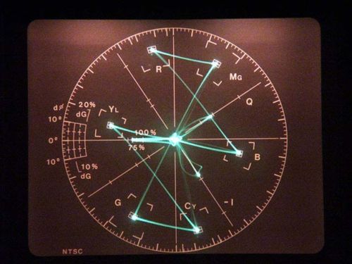
Lets take the colour red for example. Red is located top left on the vector scope. In the image above the red is sitting exactly correct in the box. If the response from the camera was slightly left or right of the box the hue of the colour would be different: slightly more yellow if it was left and slightly more magenta if it was right.
Being further or nearer the centre mark represents chroma. Typically any gamma curve desinged to hold highlights is going to move those marks closer to the centre, however, the colour hues might still be correct i.e. on the right vector.
It is important to note that on the C300 when you change your picture profile you are changing both the gamma curve and the colour matrix. These have the same names "normal 1" "EOS standard" "Cinema" etc, however, you don't have to use the two in conjunction. You could easily choose the Colour matrix of "Normal 4" but have the "Cine 2" gamma. The gamma of course protects the highlights and deals with luminance rather than effecting the colour.
Before this gets too technical, here is a real world example. A director and I noticed that on the painting we were filming the green was wildly different in the monitor, but the other colours we pretty accurate. I quickly spun through a few picture profiles on the camera and strangely the one which gave the most acurate green was "EOS Standard." However, I don't like filming with EOS Standard as I find the colours pop out way too much: red goes insane jumping off the picture and highlights blow out really easy. I then remembered the matrix setting. I dialed the matrix setting to "EOS Standard" and then I set the gamma curve to "Cine 2" as this preserved the highlights without creating an overly flat image.
This was just a quick fix on the job, but it seemed to do the trick. It got me thinking though, what happens when you need very acurate colour, not just a pretty picture? What if grass fills lots of your screen or you a doing a commercial involving limes, do you want to send mustard coloured grass or blueish limes to the edit? I am picking up green specifically here as I am aware that green is the colour that cameras often treat unusually, not just C300s. Cameras on the whole are designed to shoot acurate skin tones, as far as other colours and hues go, cameras are on the whole aiming to create a beautiful over all look rather than acurately reproduce each colour.
I later had a play around with the various colour matrix too see which produced the most acurate results. I used the SMPTE colour chart below as I found this a bit simpler to read.
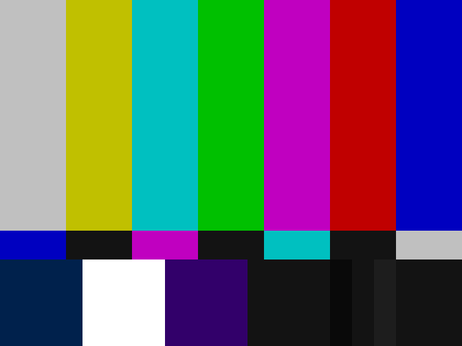
This backed up thoughts I'd had before about the EOS matrix. The green colour does get a bit more acurate, and the chroma on the red does jump up. Of all the profiles I had loaded up on my camera the one which looked the most acurate on the vector scope was from Ablecine. (There is a link to download this on a previous blog I wrote about gamma curves on the C300.)
Having descovered this, I am not now going to shoot everything I do on the Ablecine profile. Getting beautiful pictures isn't about simply recreating colours exactly. However, there are times when you look though the monitor and feel that you aren't getting the image you want. Going through the colour matrix settings and then selecting a gamma curve afterwards seems like it could be a good fix. You can of course alter the values of all of these colours to produce your own matrix settings, however, this isn't something I'd like to do without a dedicated vector scope and I am happy just to download a few profiles from trusted sources.